Trigo
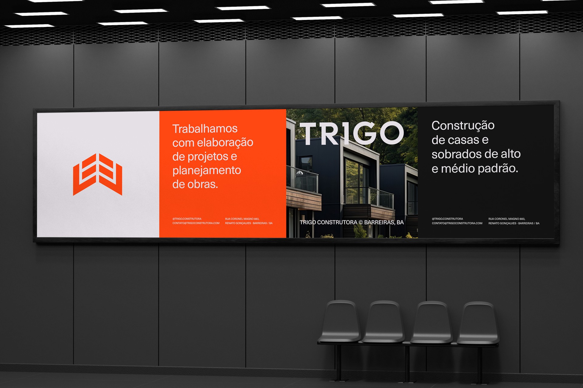
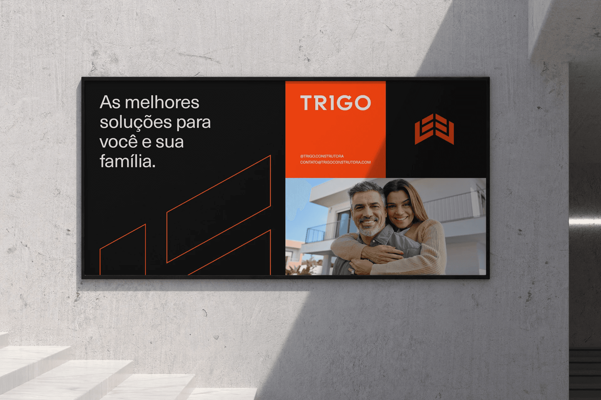
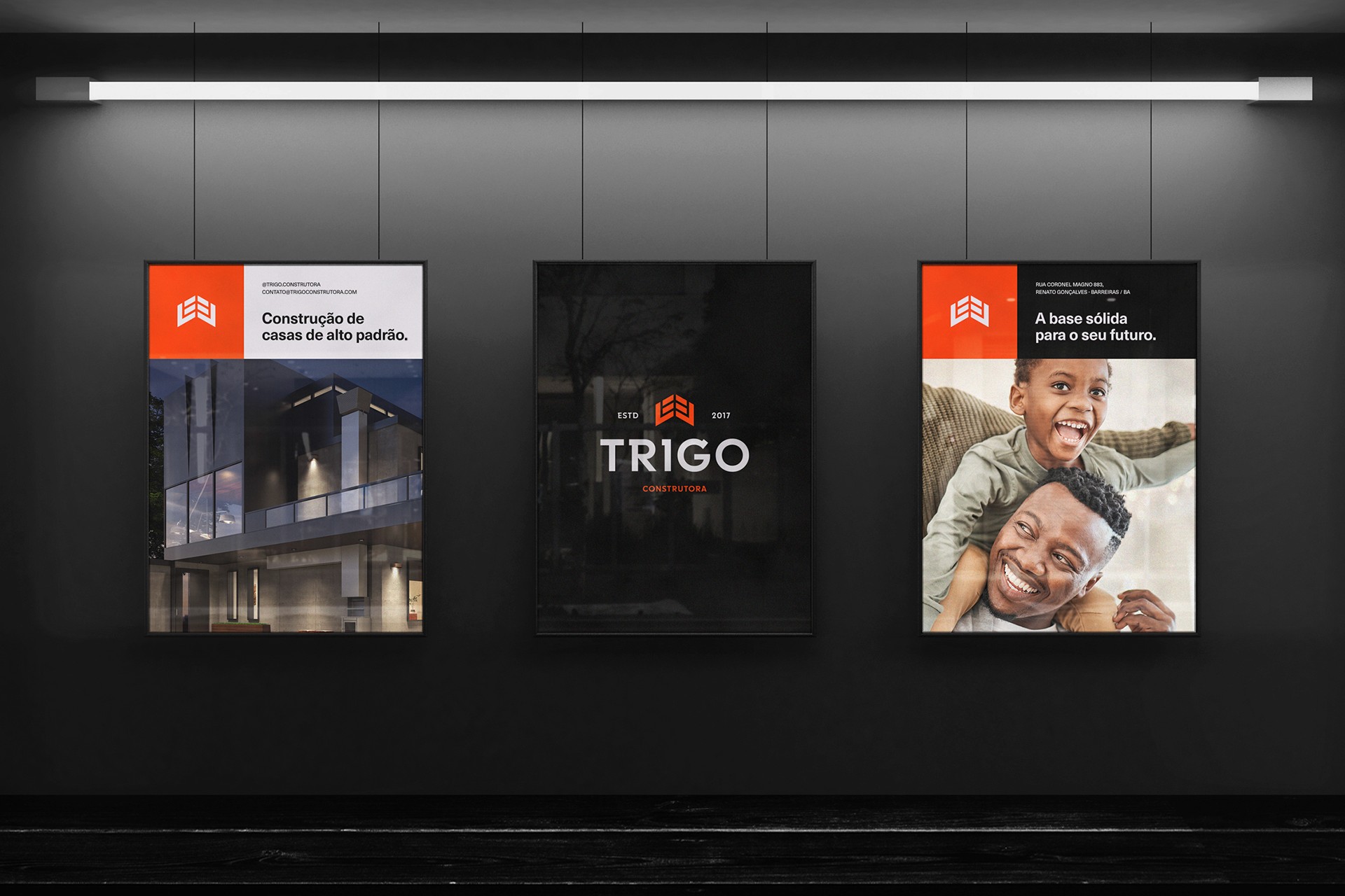
The Trigo Construtora is a company that works with project development and construction planning, architectural and engineering projects, construction of public works and high and medium standard houses and townhouses.
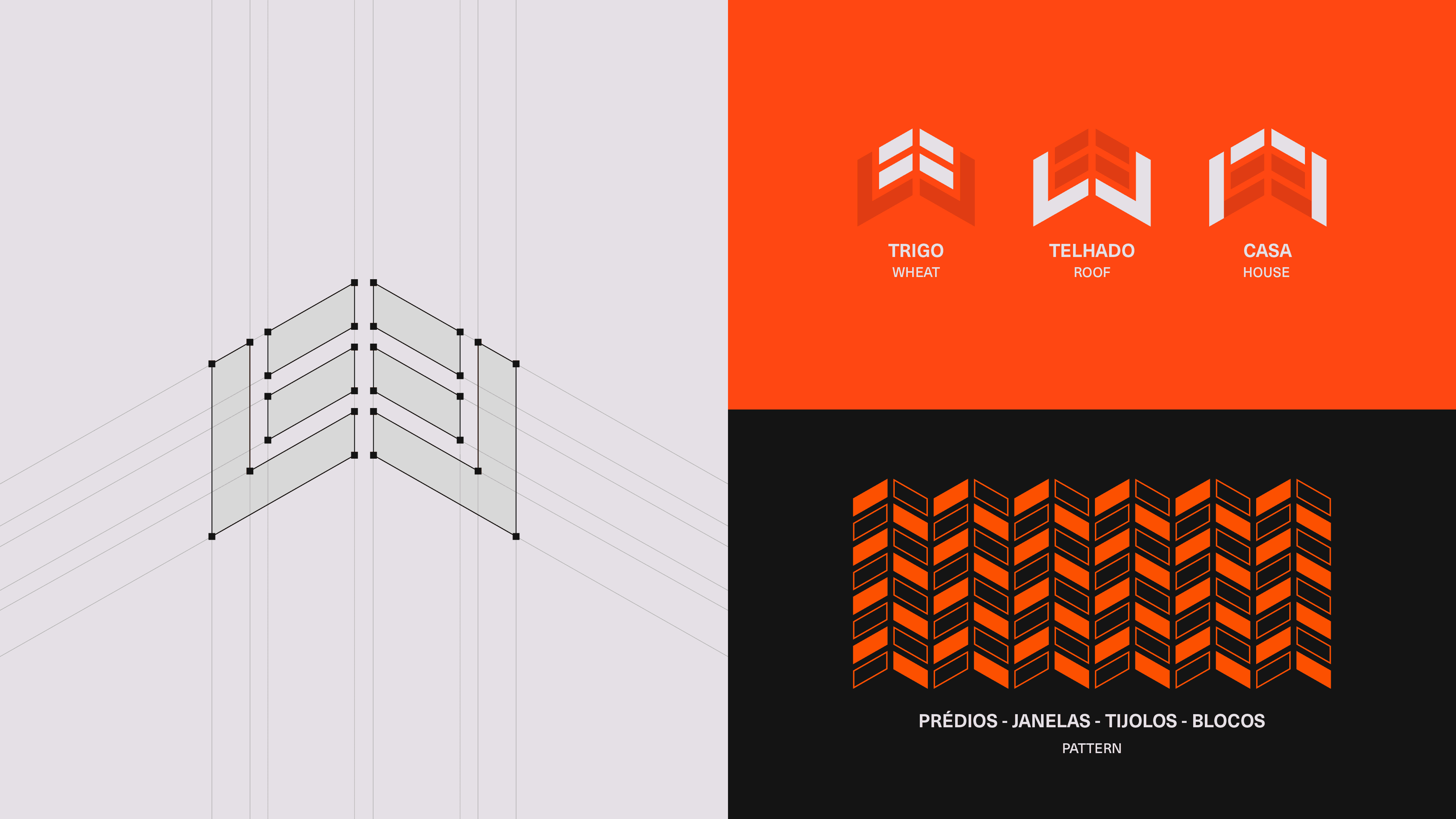
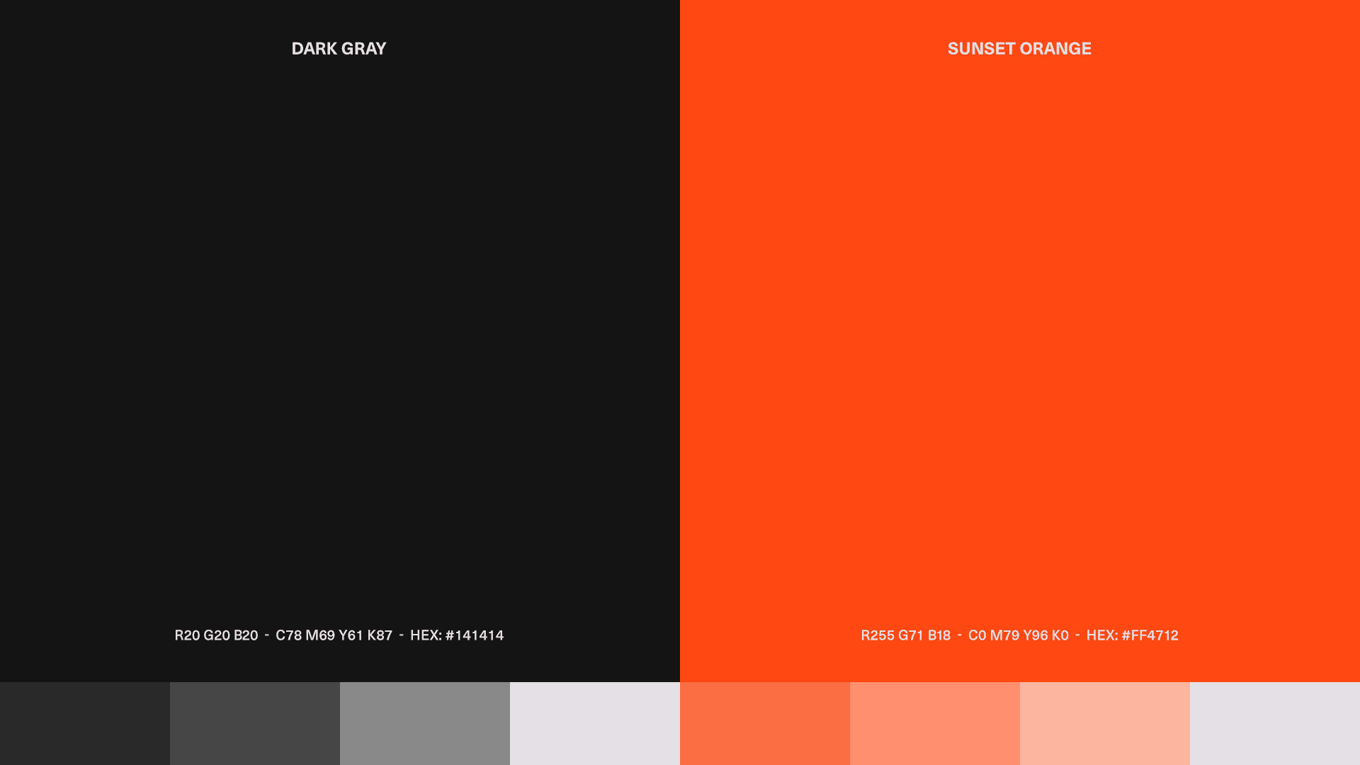
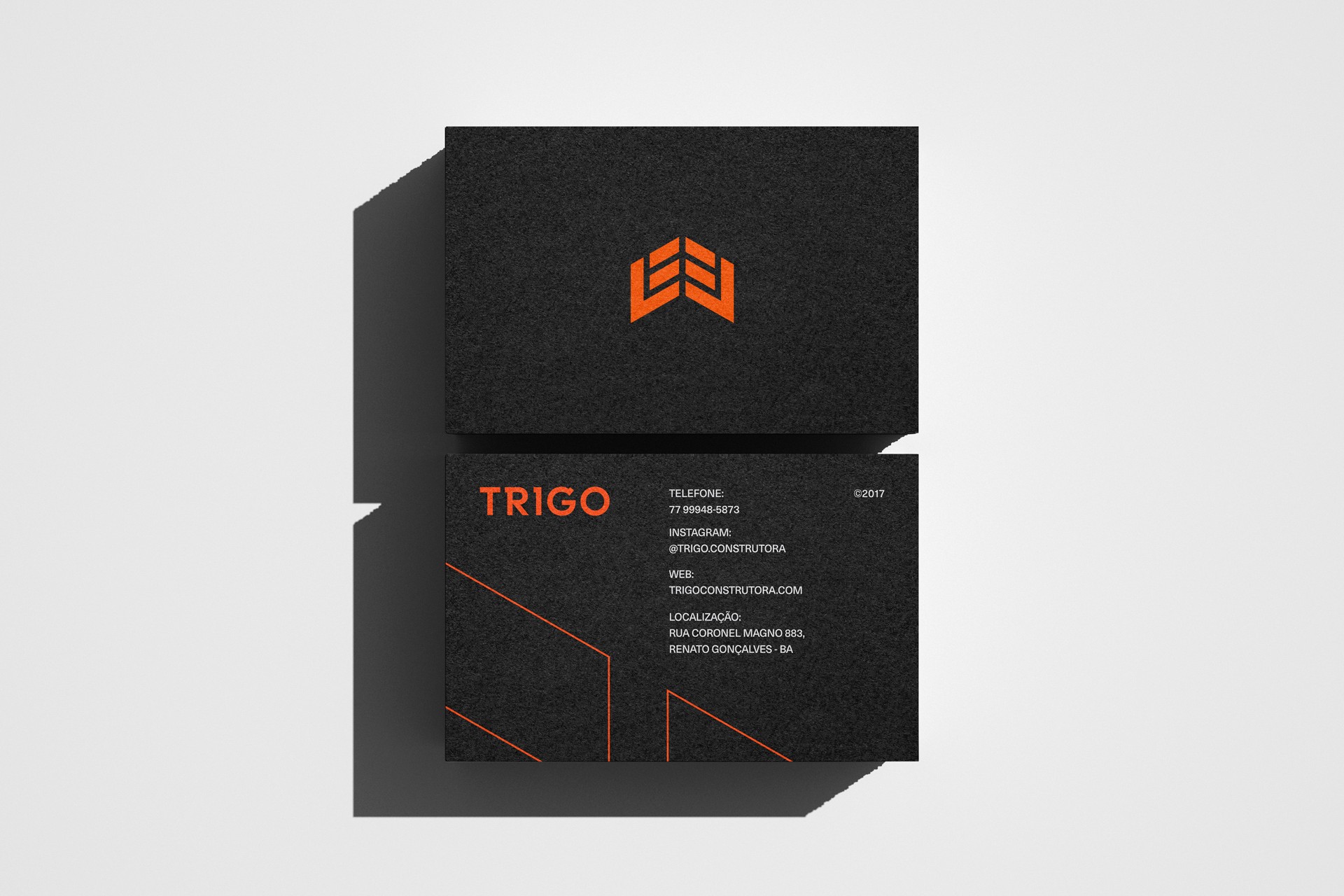
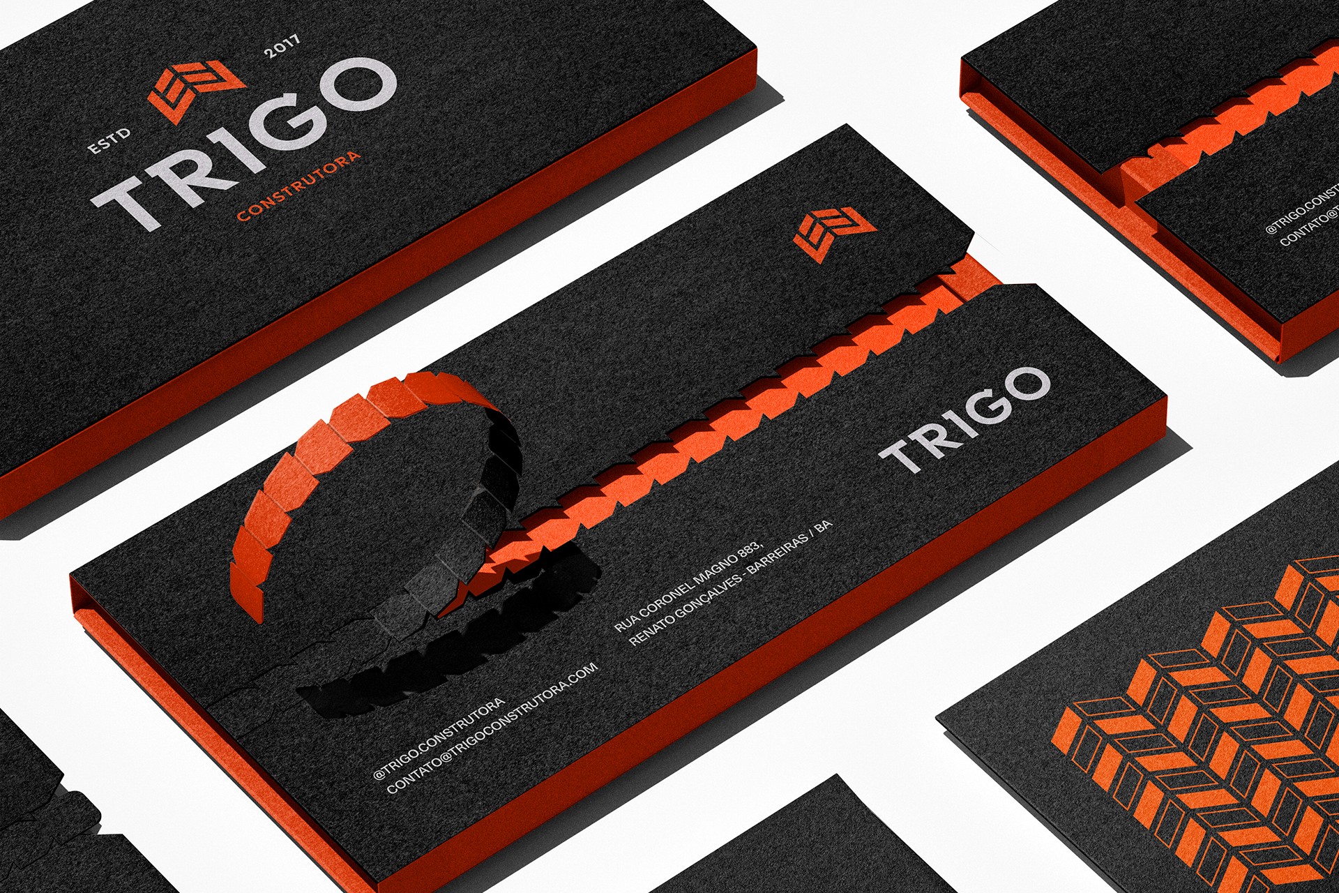
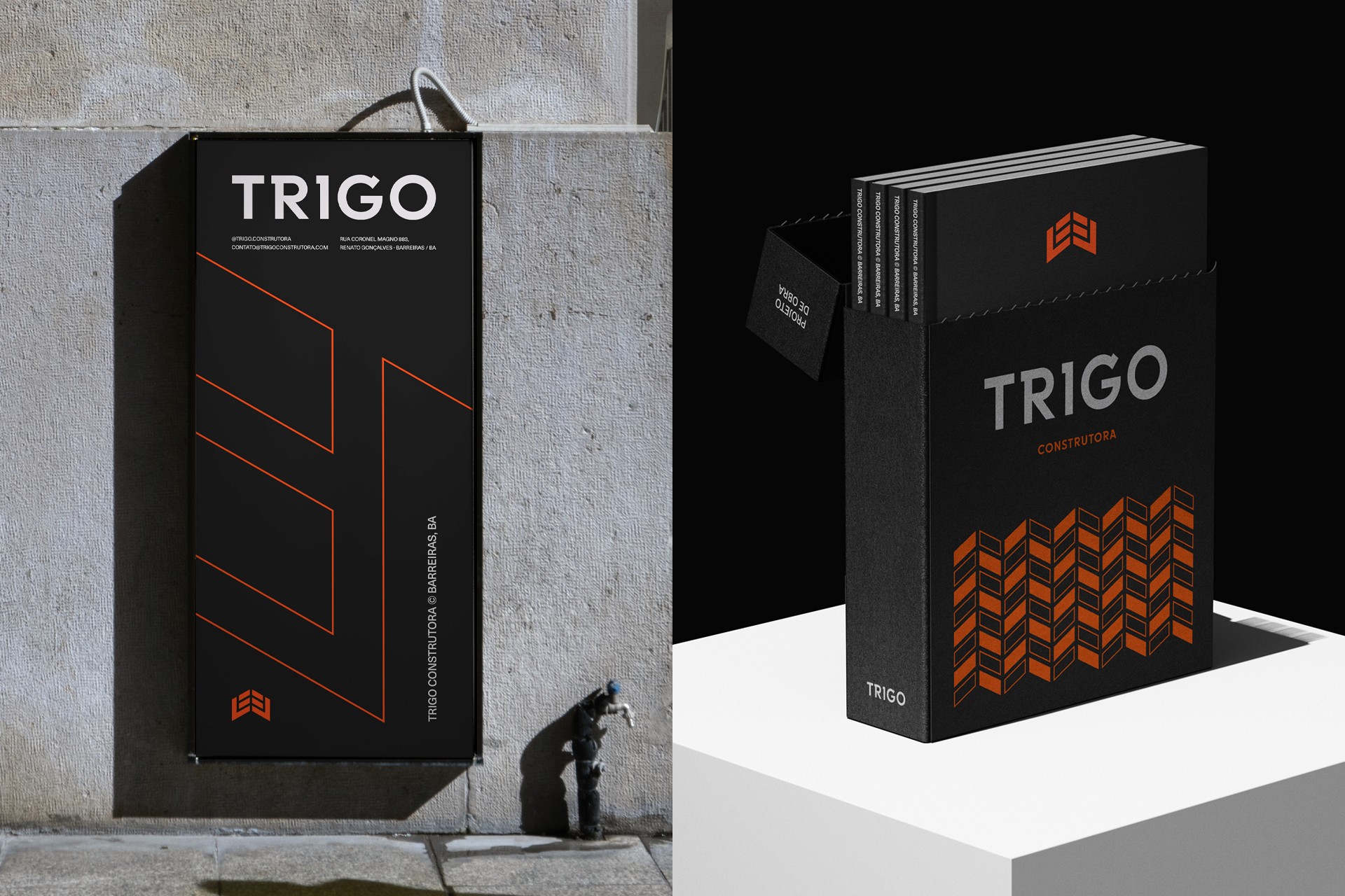
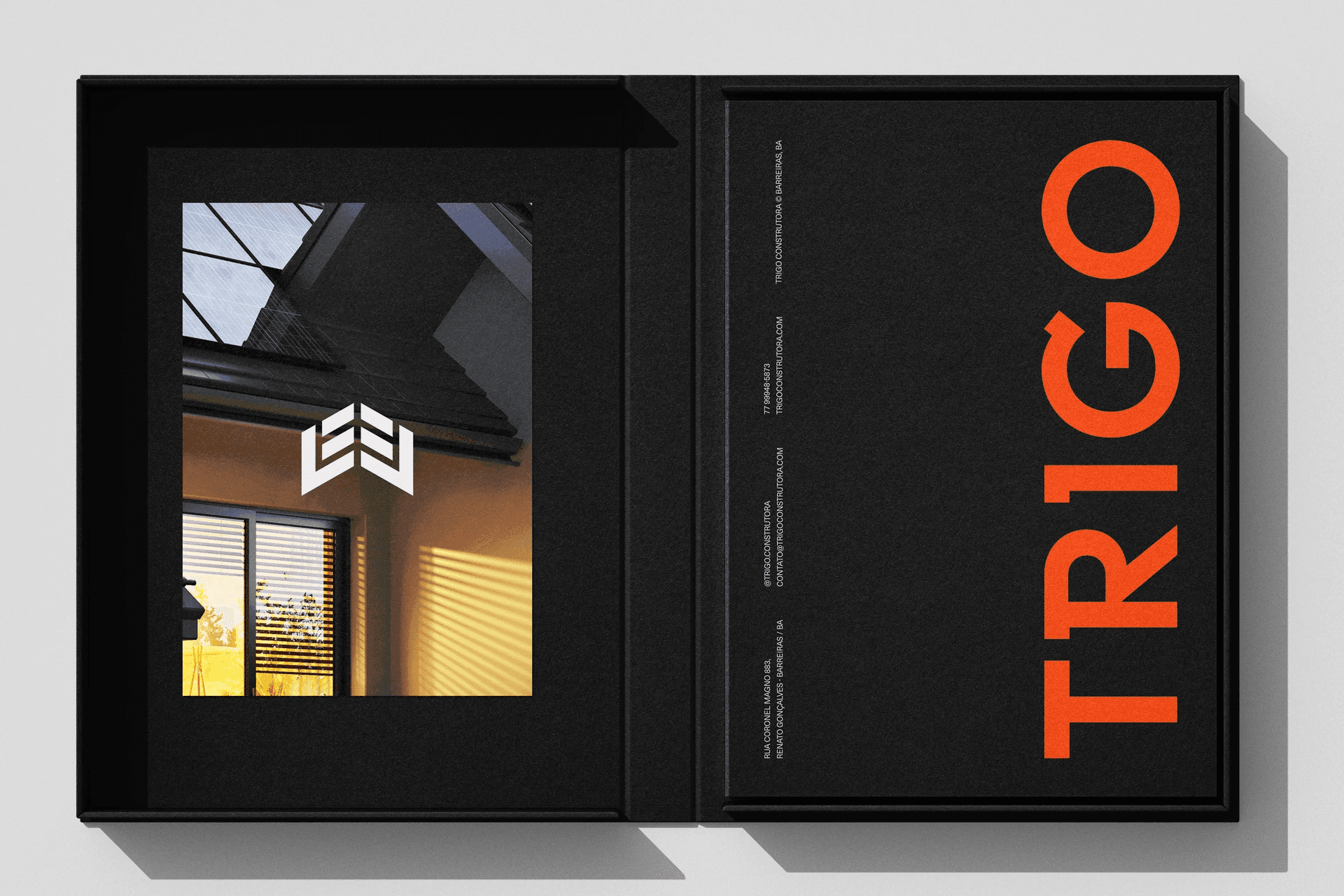
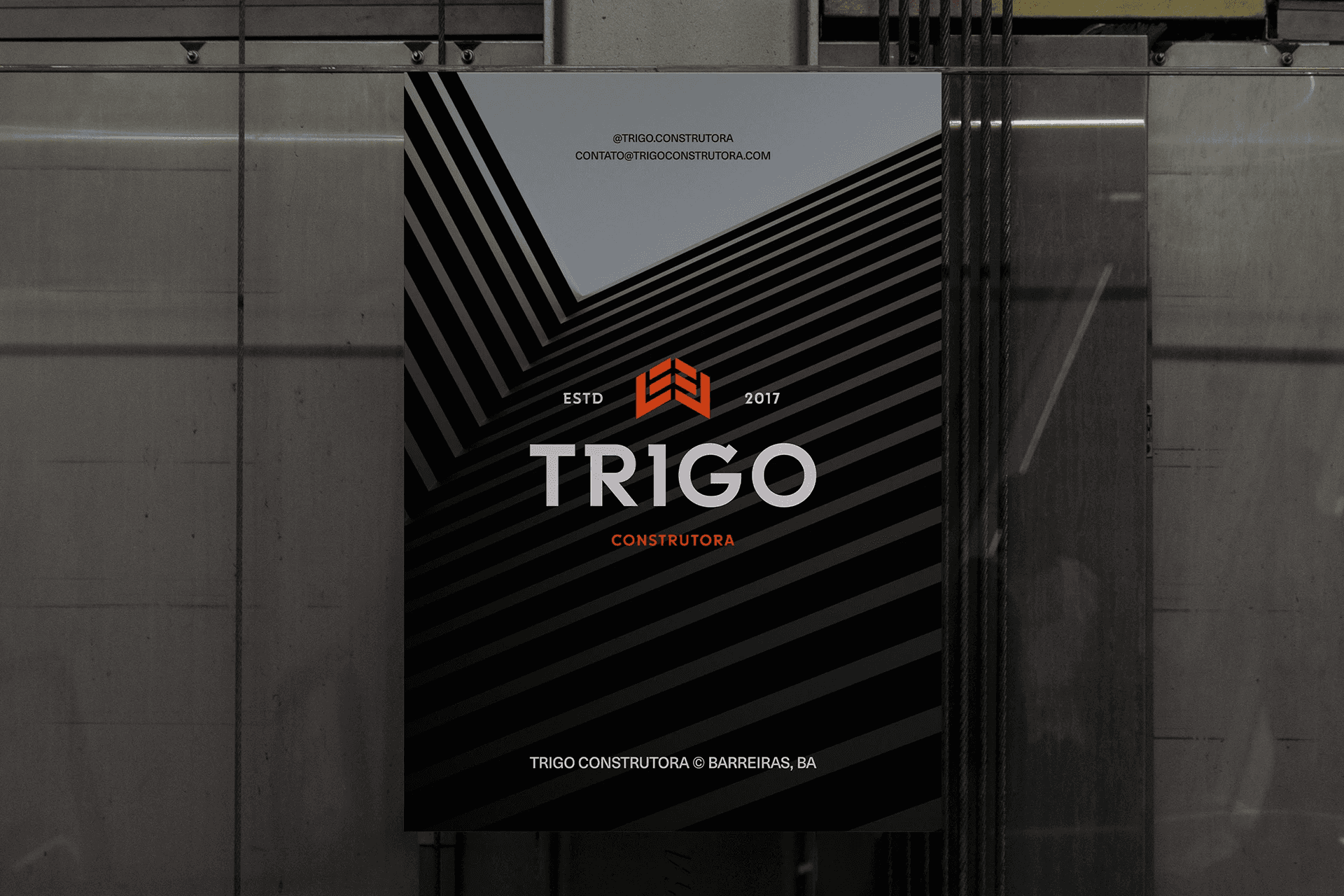
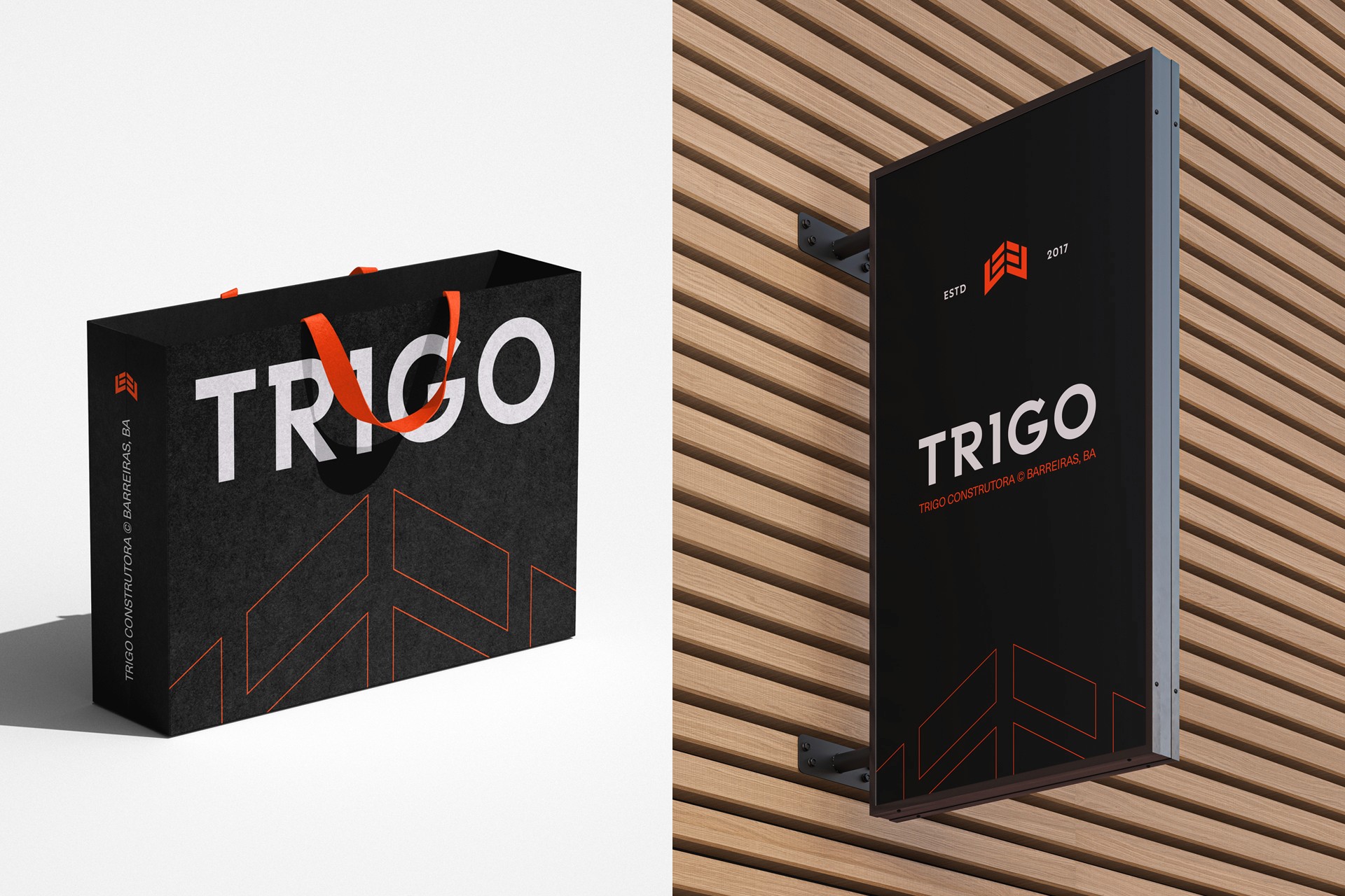
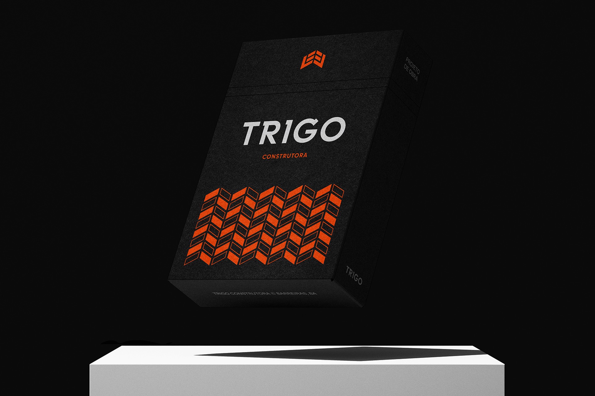
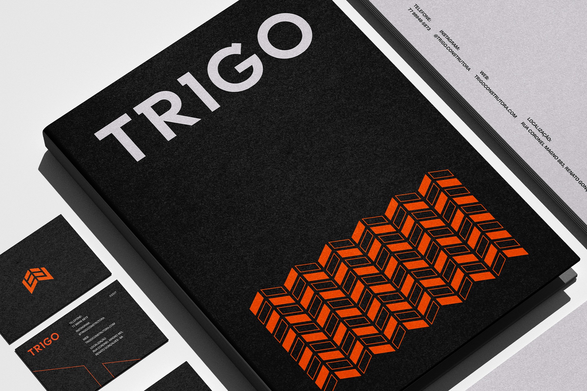
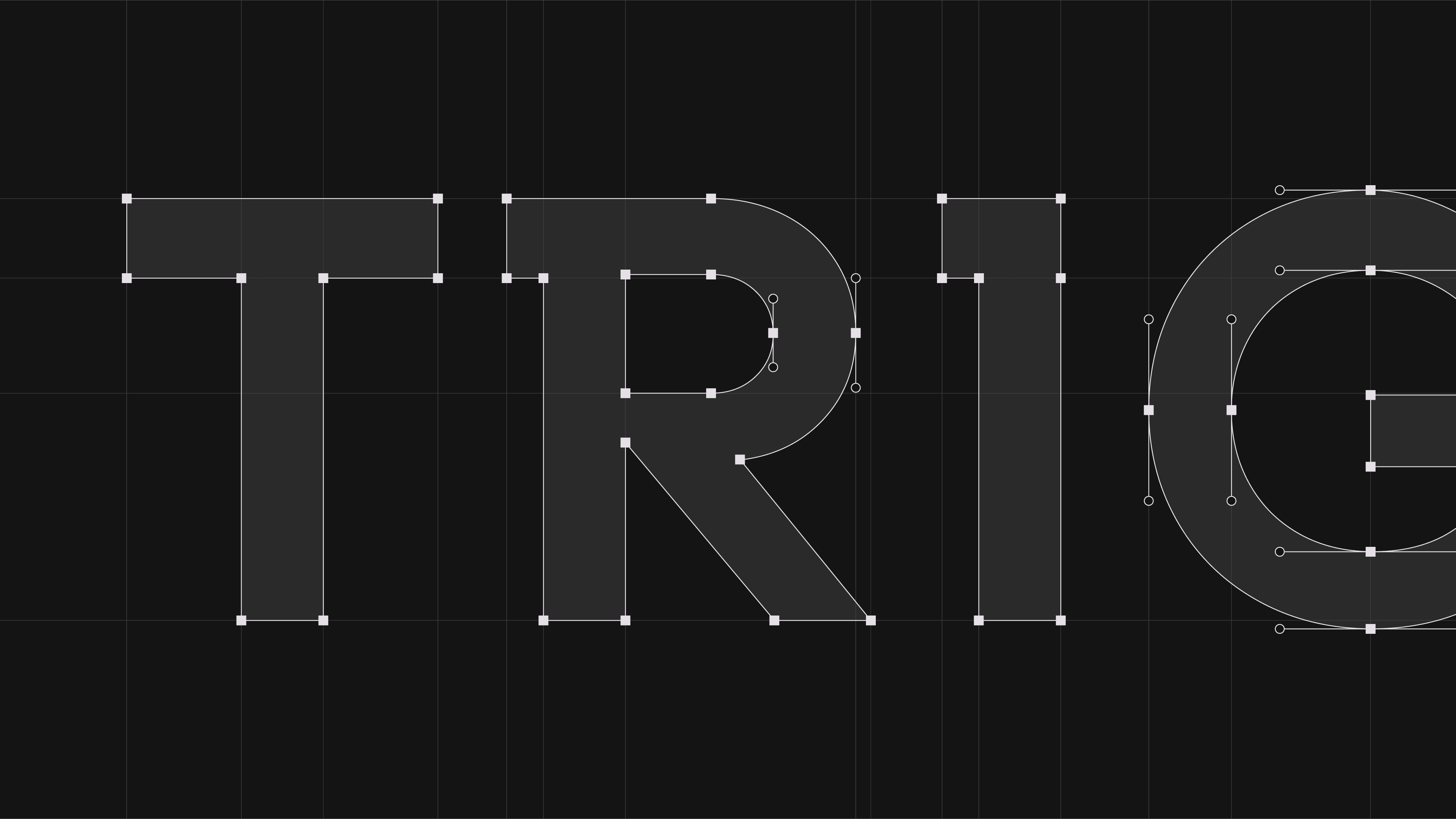
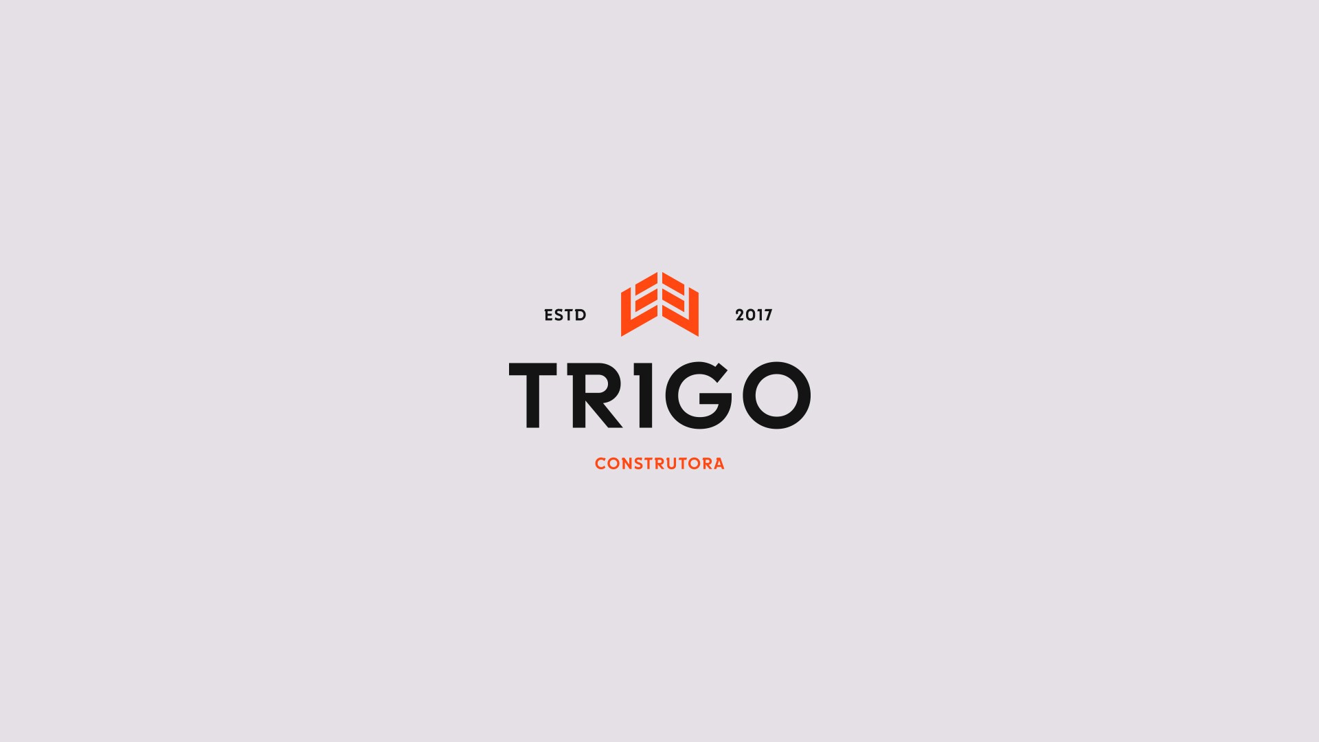
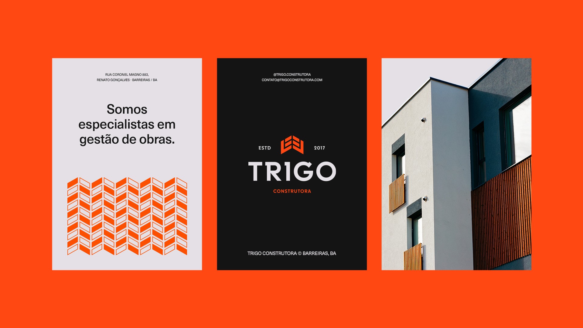
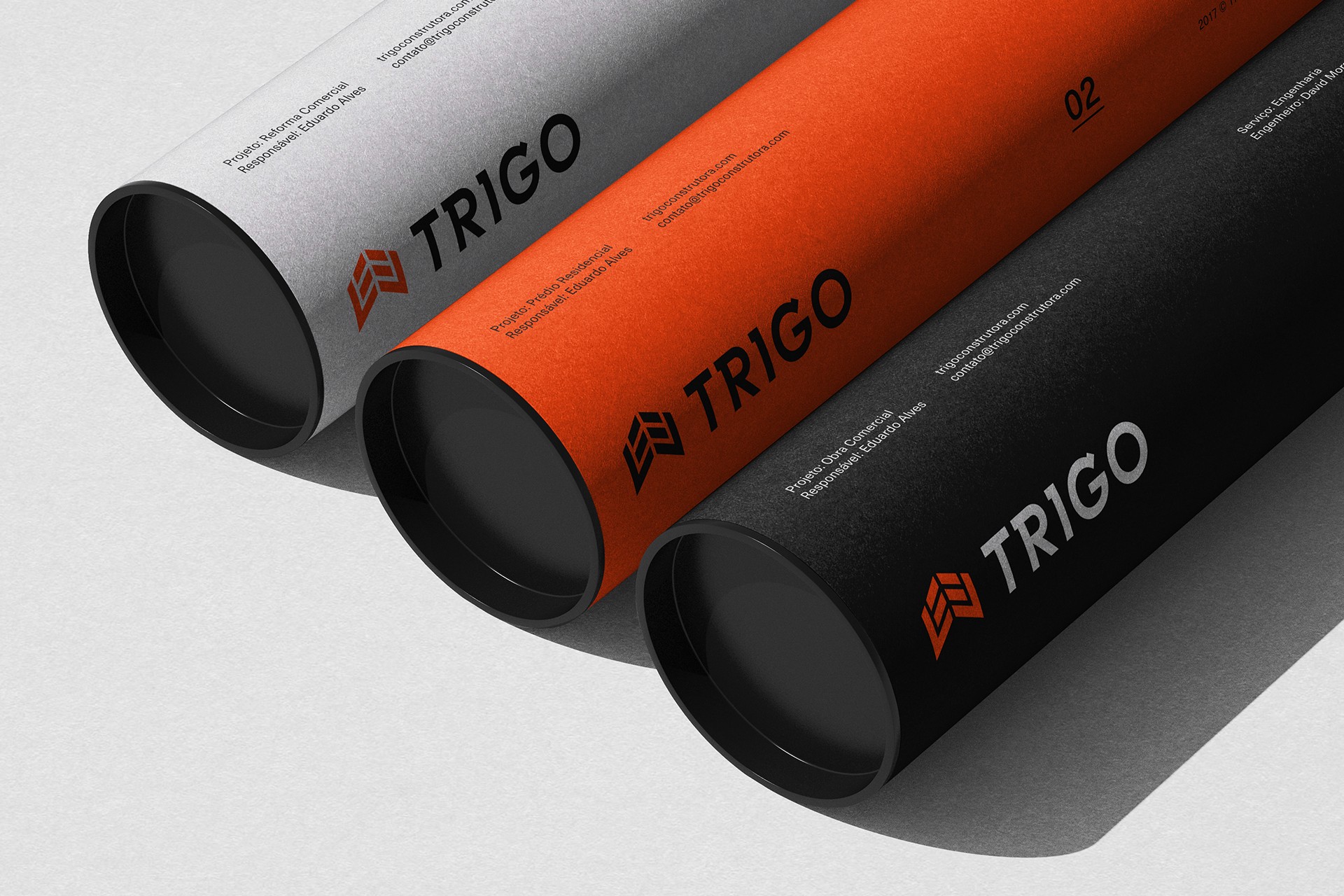
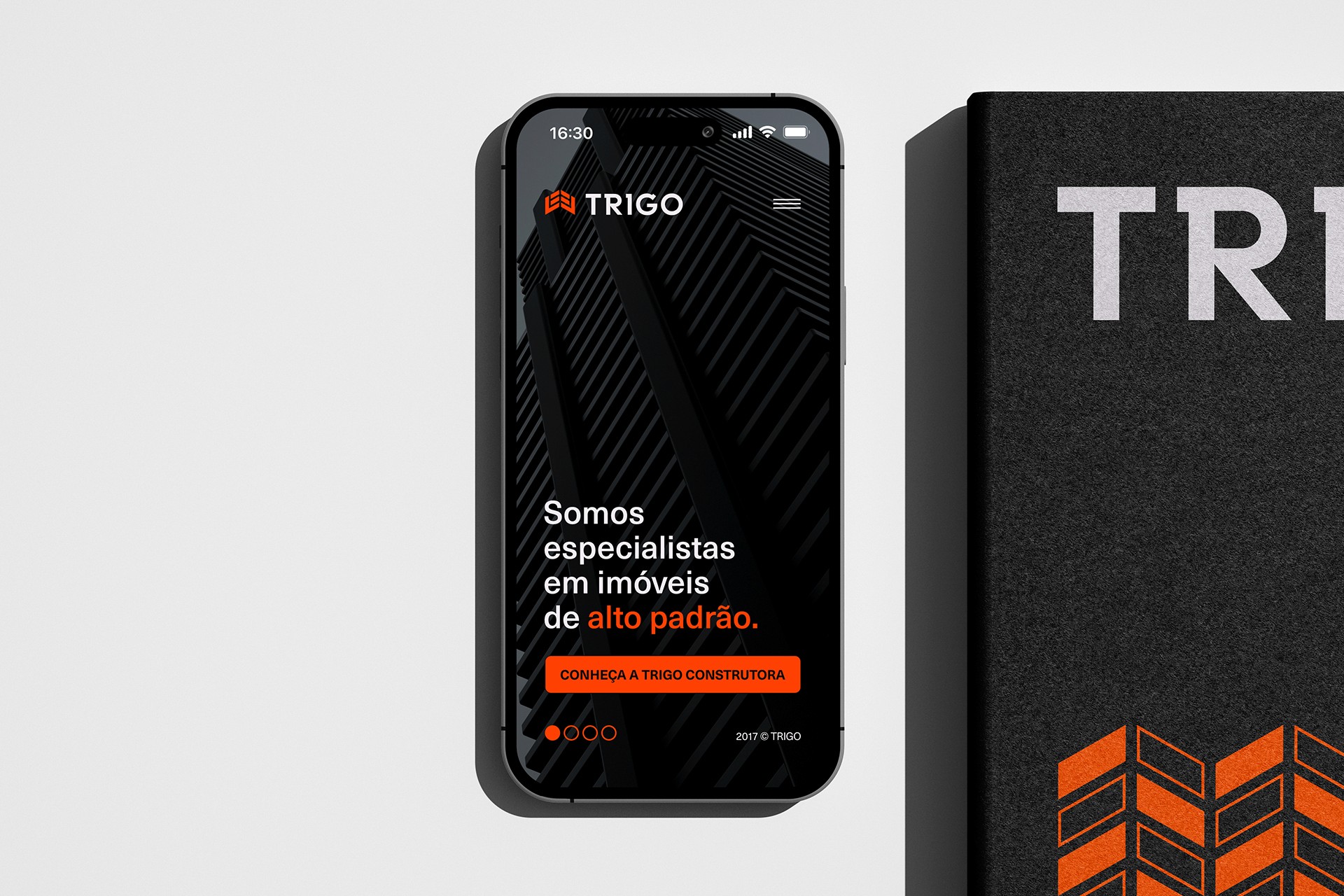
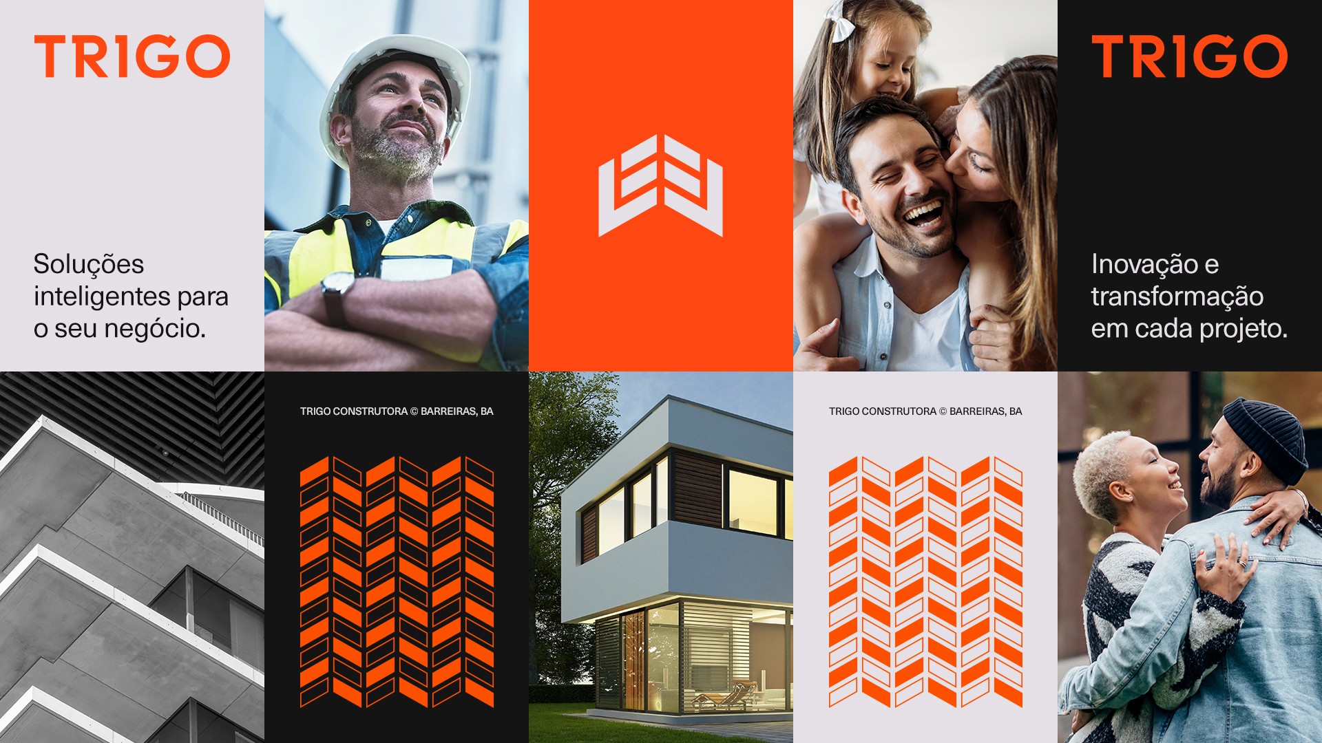
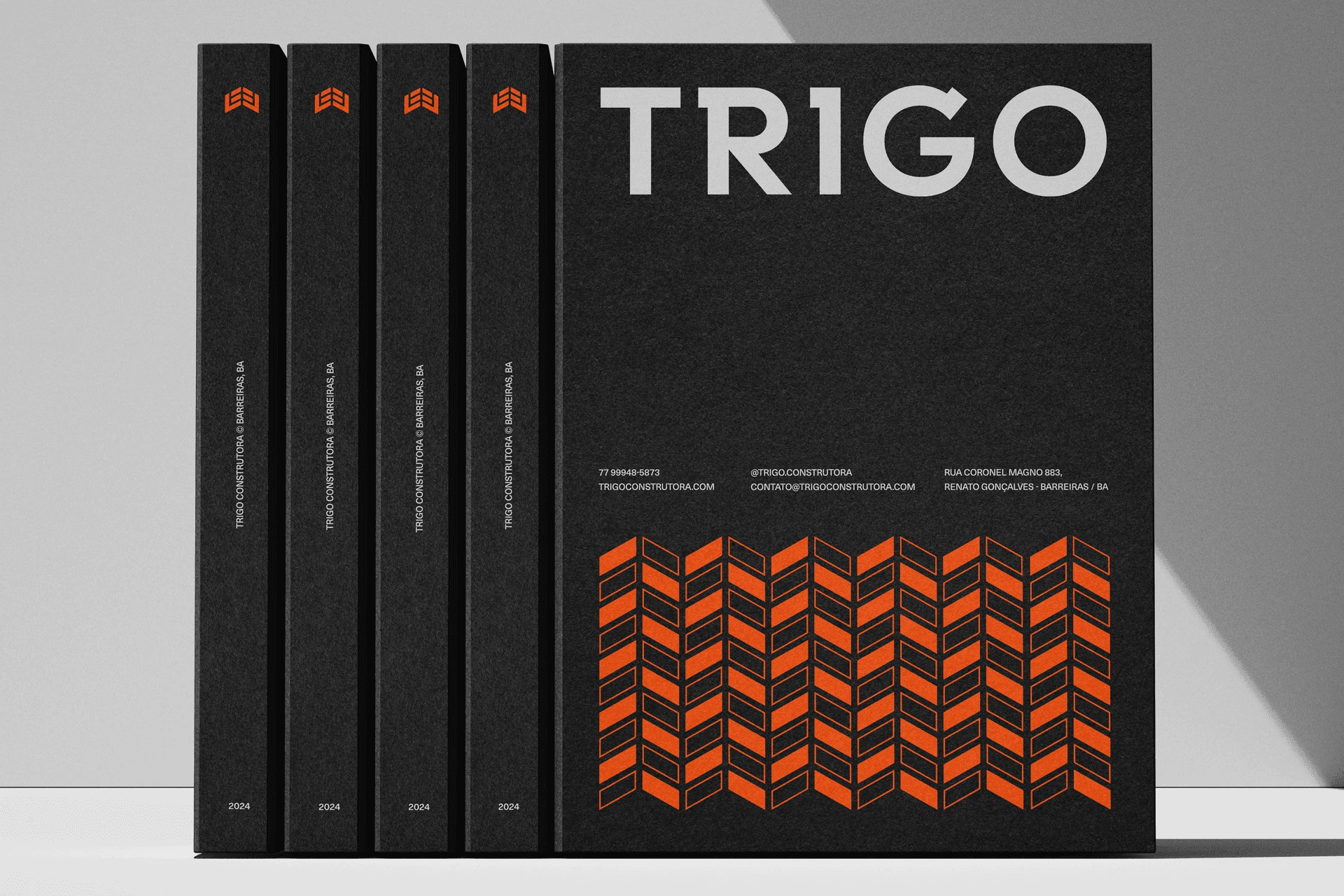
The name Trigo is inspired by a biblical passage, where a comparison is made between Wheat and Tares, with Wheat being something of value to be sought after. The name was chosen to give a sense of purpose to the brand, always valuing excellence in its services. For the visual identity, a modern and vibrant color palette was chosen, where orange stands out strongly in the symbol and pattern, the symbol represents a house, roof and wheat, important attributes of the brand and its segment.
Fill out the request so that we can better understand the project's goals and challenges, and then schedule a conversation to align all expectations. If you prefer, feel free to send an email to: design@eichstudio.com
